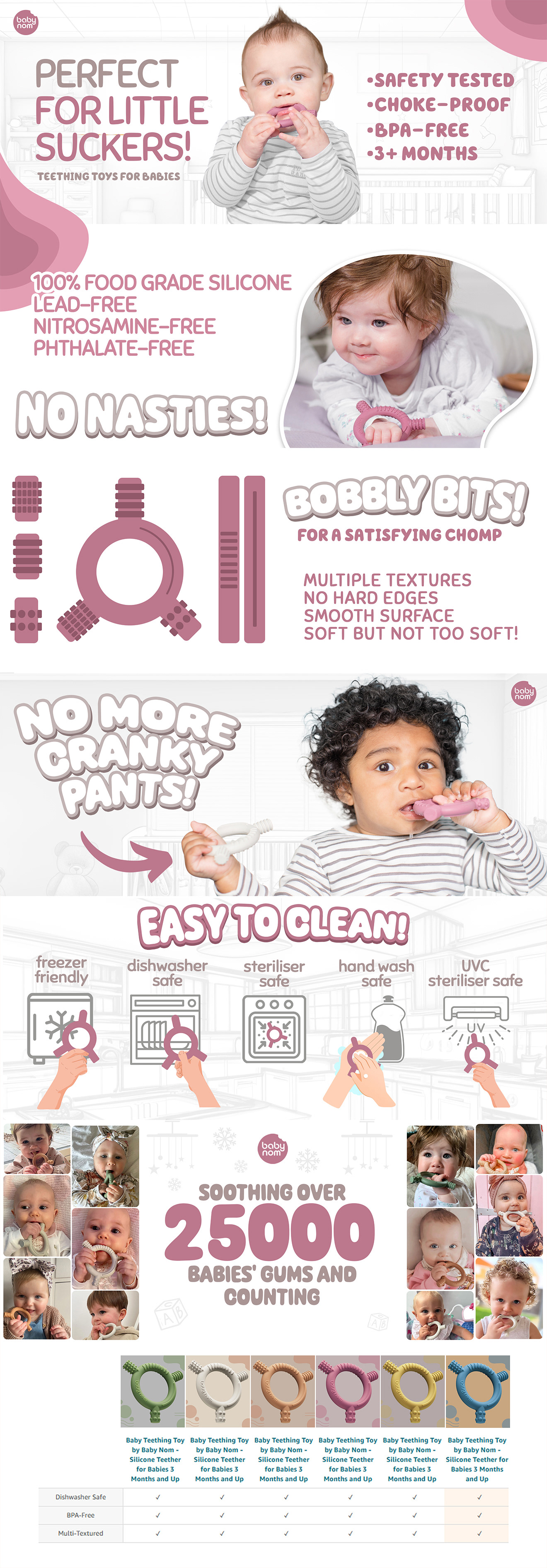
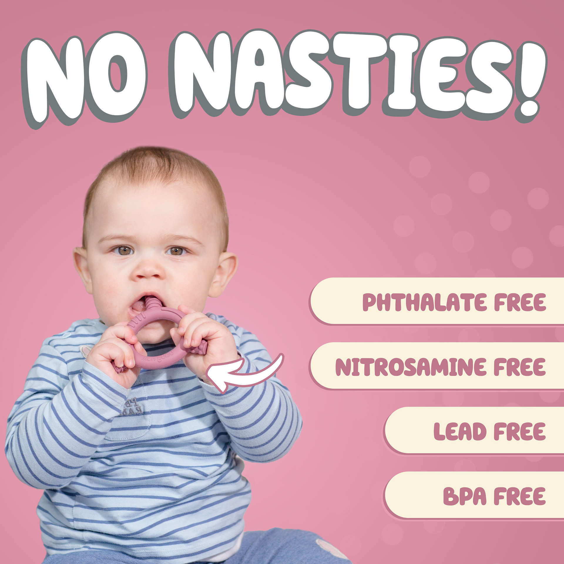
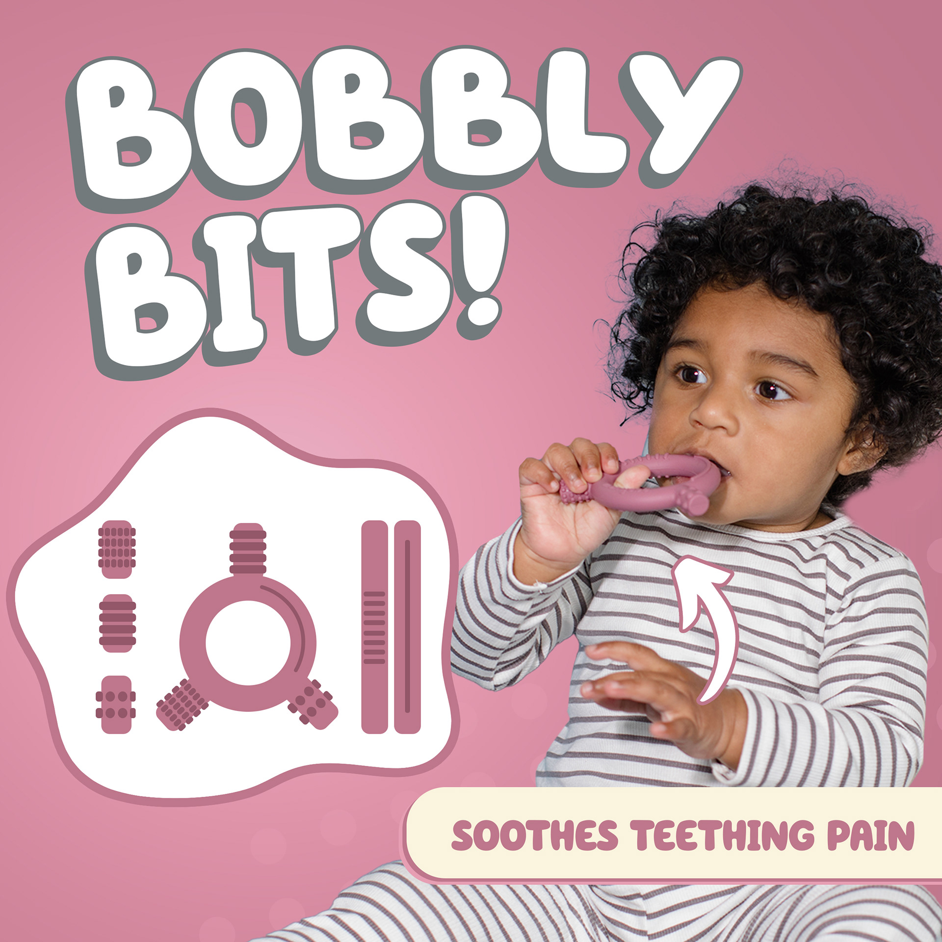
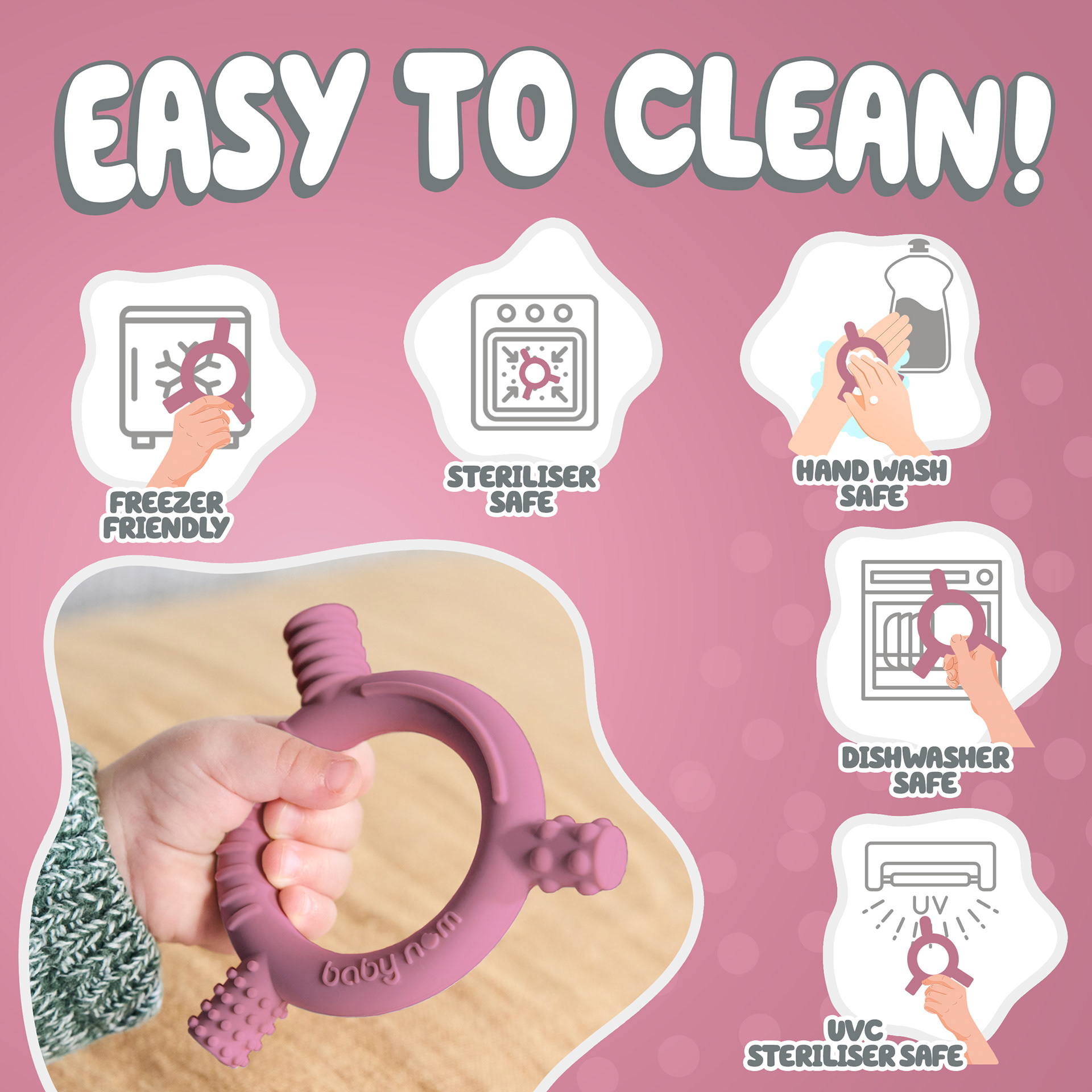
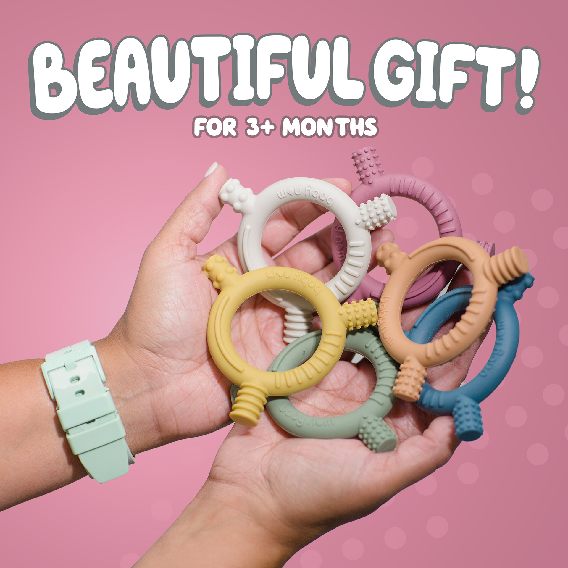
The Teether of Nombear (Baby Nom) is another great product I’ve worked on. Similar to the weaning bib, the design needs to be playful yet clean—not too serious—while clearly depicting that it’s a baby product.
For this project, the client provided pictures for each color variation. Some images required color correction or adjustments to match specific variations. However, I ensured design consistency across all images, just like with the weaning bib.
The illustrations and drawings were created by me, with only minor retouching and editing needed for the raw images. Additionally, this project involved multiple translations in 12 languages: UK (English), TR (Turkish), SE (Swedish), PT (Portuguese), PL (Polish), NL (Dutch), IT (Italian), FR (French), ES (Spanish), DE (German), DA (Danish), and CZ (Czech). I used DeepL for the translations.
Since this is a premium A+ content project, I designed both desktop and mobile versions. The listing images include six color variations across 12 languages, ensuring a high-quality and consistent presentation for all markets.